
How to choose a moodboard color palette with a clear purpose
Use color references to define roles, proportions and constraints instead of extracting an attractive palette without a plan.
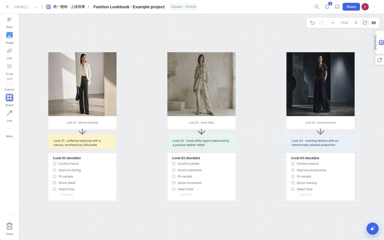
A palette is useful when it explains how color will behave. Five attractive color chips do not yet describe a website, a collection or a campaign. A moodboard should connect those choices to the project’s audience, materials and intended feeling.
Name the color’s job first
For a ceramics studio, warm ivory might create breathing room, mineral blue might support a calm identity, and terracotta might appear only as a restrained accent. Write those roles beside the references before debating exact hex values.
Consider the real output. A packaging palette interacts with paper and ink; an interior palette interacts with light and texture; an interface palette must support readable text and usable states. A moodboard helps set direction but does not replace testing in the actual medium.
Compare color in context
Use the Graphic Design Moodboard starter for broad visual direction, or Fashion Lookbook when material and silhouette matter. Add reference images that show the palette in use. A blue swatch and a photograph of blue glass communicate different qualities because reflection, translucency and surrounding color change the result.
Compare a few deliberately different options. If every reference has the same composition and lighting, it may hide how the palette behaves under different conditions.
Add a working swatch and a caption
Choose Swatch from More in the creation toolbar. Edit the color value and caption to record a working choice. Keep the caption practical: “Accent only; pair with warm ivory” helps more than an evocative name without a role.
| Role | Question to answer | Example note |
|---|---|---|
| Background | How much space should it occupy? | Warm ivory is the dominant field |
| Supporting color | What should it reinforce? | Mineral blue supports calm surfaces |
| Accent | What deserves attention? | Terracotta appears in a few key details |
| Text or detail | Where must contrast be checked? | Validate charcoal on the actual background |
The board records intent. It does not automatically certify accessibility, print accuracy or a complete color system.
Edit for proportion, not just harmony
Look at the overall board. If an accent dominates every reference, reviewers may interpret it as the main color. Adjust image selection and scale so the visual proportions support the written plan.
Keep source and licensing notes for photographs, type samples and third-party identity references. Color inspiration does not authorize reproducing a brand’s logo, packaging or complete visual composition.
Turn review into a usable decision
Ask which combination fits the audience and intended output, what becomes hard to read or produce, and whether the palette supports the chosen material language. Record the chosen direction and the tests still needed in a short note.
Start with the Graphic Design Moodboard or Fashion Lookbook, then carry the working palette into the tool where the final design is made.