
How to make a client-ready moodboard, from brief to review
A working example for collecting references, editing the direction and asking for feedback that can move the project forward.
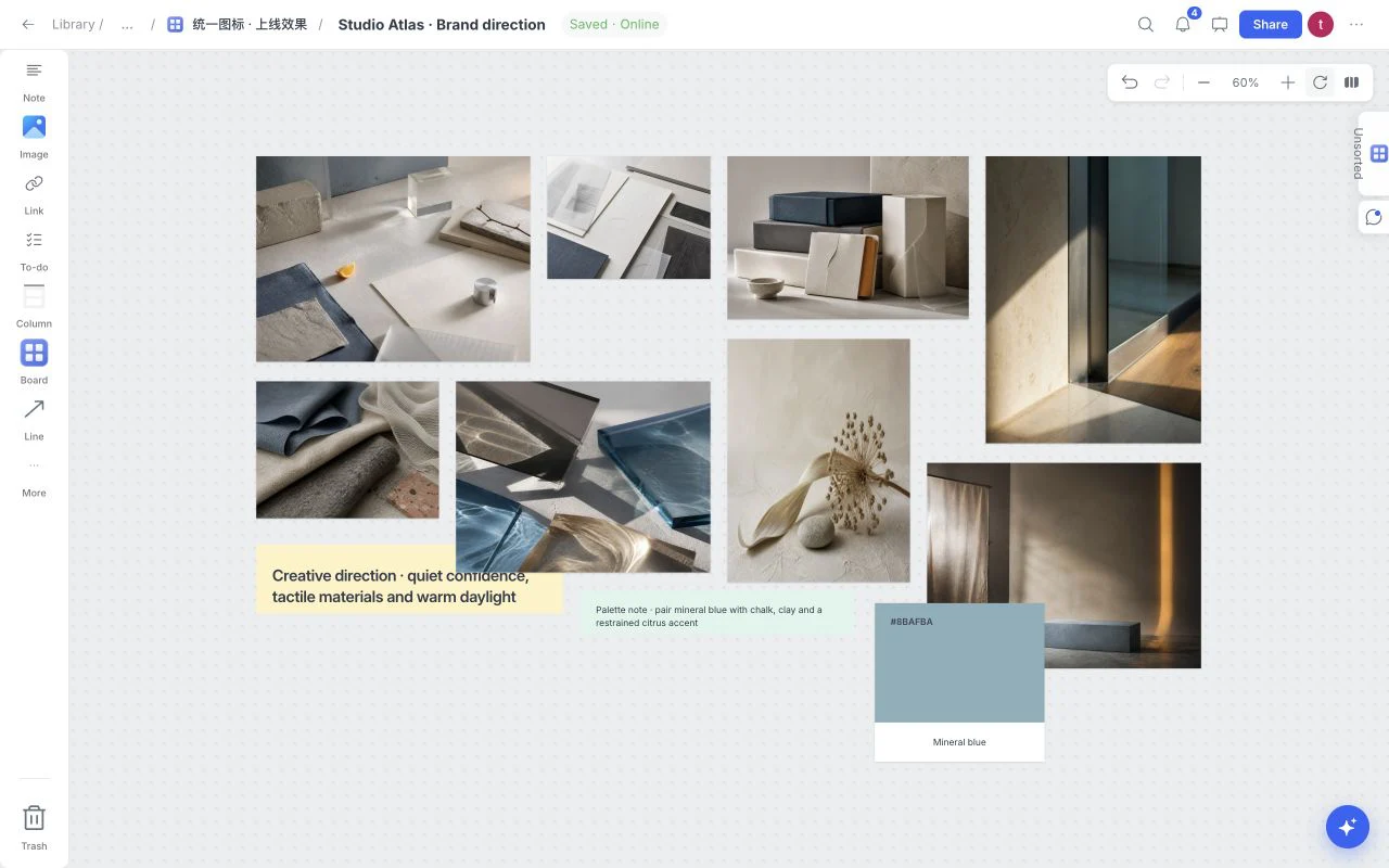
A useful moodboard makes one decision easier. For this example, imagine a small ceramics studio choosing the visual direction for its first online shop. The goal is not to collect every attractive interior photograph. It is to agree on the light, materials and tone the website should express.
Begin with the decision and its constraints
Write a short note: “Choose an editorial direction for handmade ceramics: warm daylight, honest surfaces and room for the objects.” Add the audience, intended output and constraints. Here, the photographs must work on a small screen, the palette must leave space for product colors, and the result should feel calm rather than precious.
In Moodboard, open the board menu and choose Templates, then Graphic Design Moodboard. Keep example content if you want to understand the composition. Apply without examples if you want the structure and your own references. Template application is one canvas change, so Undo removes it in one step.
Collect with a reason attached
Drop in your own images or use Image from the creation toolbar. Add links to the original sources. Use short notes to explain what matters: “Borrow the soft shadow, not this room’s furniture.” A reference can be useful for composition without being an instruction to reproduce its subject.
Keep source and license information alongside anything you may use outside the board. Organizing an image does not grant permission to publish it in a campaign. For new project files, wait for Saved before sharing or exporting the board.
Edit for a consistent visual language
Make three passes: collect broadly, group the recurring qualities, then remove references that pull the direction apart. Compare light, proportion, texture and color instead of deciding only whether an image is beautiful.
| Reference | What it contributes | What to avoid copying |
|---|---|---|
| A sunlit material study | Soft directional light | The exact arrangement |
| A linen detail | Tactile restraint | Its use as an unrelated decoration |
| A packaging photograph | Space and proportion | Another brand’s identity |
Use a Swatch for a working color and a caption explaining its role. Avoid treating an extracted palette as a complete identity system; test contrast and use in the actual design later.
Ask a reviewable question
Prepare the reading order: brief first, strongest reference next, supporting palette and rationale after it. Use Present for a focused walkthrough. In Share, choose the recipient’s role and review the password and download settings before sending a link.
Ask whether the direction fits the audience, which reference expresses it most clearly, and which detail would block production. “Do you like it?” leaves too much room for unrelated opinions. Comments should lead to a decision note and a next action; they are not a formal approval workflow by themselves.
Finish with a small delivery checklist
- The audience and decision are visible.
- Each reference has a clear purpose and a source where needed.
- Competing directions are separated.
- Open questions are distinct from decisions.
- Saved confirms that the current board and uploads are ready.
- Export settings match the deliverable you actually need.
Start with the Graphic Design Moodboard template, then use the sharing and export help to prepare the review.